


Microsoft Ignite Session Catalog: Visualising in PowerBI
I recently blogged a few different posts, focusing on visualising information found in the Ignite Session Catalog. I promised a blog post on how I got this information. Here it is.
The landing page for the Session Catalog is at: https://myignite.techcommunity.microsoft.com/sessions. Looking at the network traffic for that page, you’ll notice that the actual data about sessions is coming from an API call, to http://api.myignite.microsoft.com/api/session/anon/search.
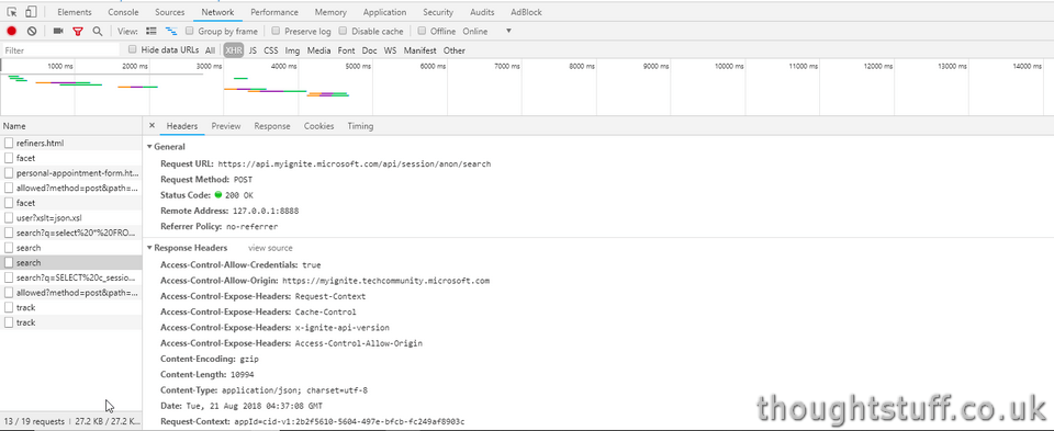
Slightly unusually, the call isn’t a GET request, it’s actually a POST. This is because the body of the POST contains some information about what to search for. For instance, to search for Teams sessions, the body might look like:
{“itemsPerPage”:10,”searchText”:”teams”,”searchPage”:1,”sortOption”:”None”,”searchFacets”:{“facets”:[],”personalizationFacets”:[],”dateFacet”:{“startDateTime”:null,”endDateTime”:null}},”recommendedItemIds”:[],”favoritesIds”:[]}
The response for this call is JSON, and is a collection of matching sessions. Whilst there are a lot of fields describing these sessions, not all the data is yet in place. My guess would be that this will get filled out over time as we approach Ignite.
Here’s how I took this API and visualised it in PowerBI.
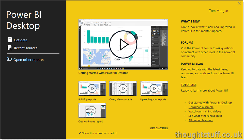
If you don’t already have PowerBI, you can download PowerBI Desktop for free.
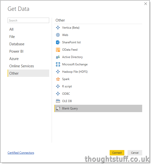
There are built-in data collectors for lots of things, including APIs, but they assume that the API call is making a GET request. Because there is nothing built-in for making POST requests, click Get Data, then go to Other, and Blank Query.
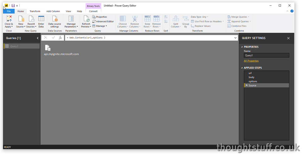
Click the Advanced Editor button in the toolbar, and paste in the following code, which performs the POST request to the Ignite Session API, and gets back the data. Notice that I’ve set the search term to “*” because I want to get ALL the session data back. It’s going to be easier (and faster) to get everything back once, then filter and sort in PowerBI, than to make multiple API requests. I’ve also set the ‘itemsPerPage’ value to be high to make sure I get back every session. It’s going to take a bit longer (and would be the wrong thing to do if this was for a responsive website), but it means I get all the data in a single call.
let

url = "https://api.myignite.microsoft.com/api/session/anon/search",
body = Text.ToBinary("{""itemsPerPage"":1000,""searchText"":""*"",""sortOption"":""None""}"),

options = [
Headers =[#"Content-type"="application/json"],
Content=body
],
Source = Web.Contents(url,options )
in
Source
Make sure that the syntax checker at the bottom is happy, and then click Done.
Double click the icon in the middle of the screen (with api.myignite.microsoft.com written underneath) to ‘open’ the data.
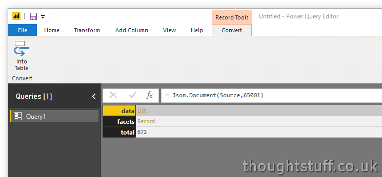
You’ll see it’s split into 3 parts, which represents the actual JSON result (which is in three parts). The ‘facets’ section is interesting, but only contains totals by different attributes, which is data we can get in PowerBI anyway, so we can ignore that. The real session data is within the ‘data’ section, so let’s click the ‘List’ link next to that.
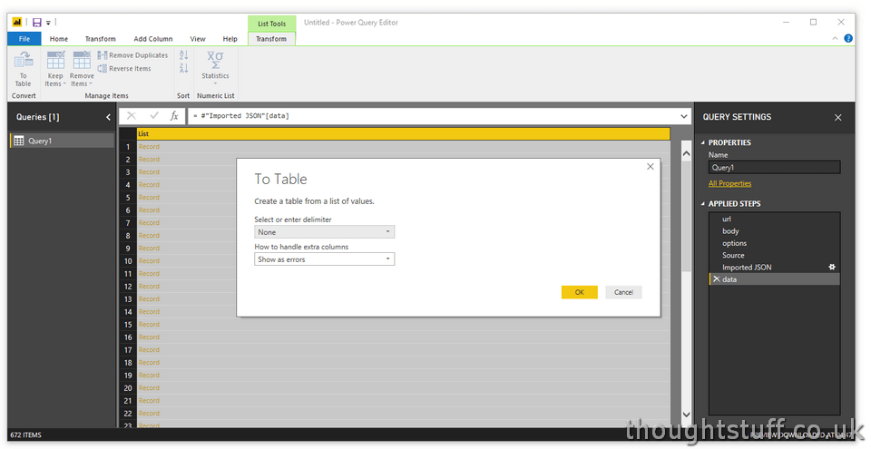
(Notice that as we do this, on the right-hand side we’re building up a list of Applied Steps, or actions which we’re applying to our data. If you want to retrace your steps, or make a mistake, you can remove steps here.)
Now we have lots of rows, but each one is just shown as a ‘Record’. We’ll fix that in a moment, but for now, click the ‘To Table’ button on the toolbar to tell PowerBI we want to take this data and use it later.
Now, let’s break open that Record object within our table to get at the data! Notice just to the right of the column heading ‘Column1’, there’s a icon with arrows. That’s what will split the record into separate columns. Clicking it will give you a preview and let you choose what columns to include:
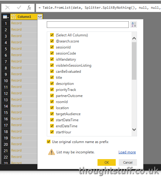
I’m going to keep everything, but untick the option at the bottom to ‘Use original column name as prefix’ because this is the only column I’m expanding.
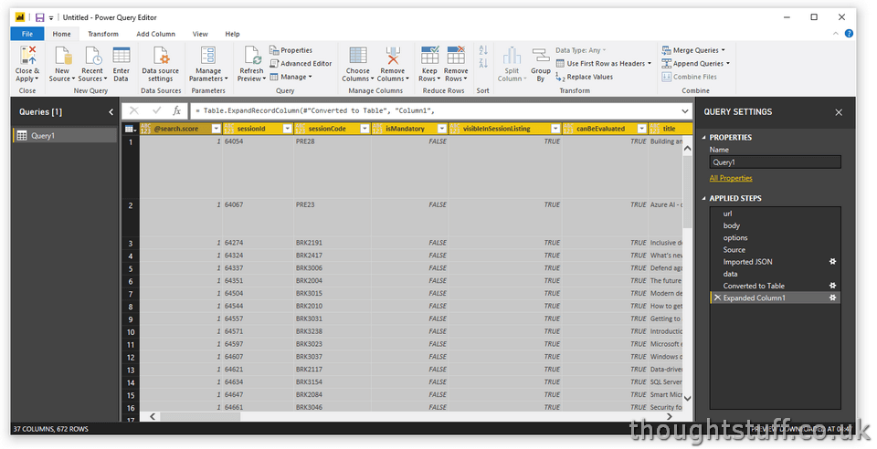
Suddenly, things look much more exciting. We have actual session data! However, we have one more task to do.
We now have one row per session, but the JSON that comes back from the API has arrays for things that might have multiple values, such as products, categories etc. If we scroll to the right we can see that these are shown as ‘List’ items, signifying that there is potentially multiple pieces of data here. There are a few different ways to deal with this, but the one I’m going to use is to make PowerBI split each combination into its own row. This greatly increases the number of rows and results in what looks like lots of rows with the same session name (one row for each combination of the things we split), but PowerBI is clever enough to remove duplicates when visualising where it makes sense, so this isn’t actually a real concern.
Simply go along the list and click the expand icon in the column header for each list you’d like to use, choosing to ‘Expand to New Rows’ each time:
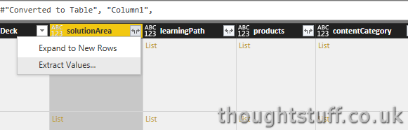
The only gotcha to look out for here is that when you are visualising later, and want to chart counts of different attributes, such as a count of session IDs per category, make sure to check the you are doing a Count (Distinct) and not just a Count, to remove any duplicates caused by expansion.
There’s lots of other things you could do here, such as grouping, replacing null or empty values, or changing the default data types of columns, but for now, I’m going to click Close & Apply (because this blog post is long enough already!). This will load the data into the table, and make it ready for you to start visualising. Because of all our expansion, we’ve exploded the size of the dataset, but you’ll notice that PowerBI does a good job of handling large sets quickly.
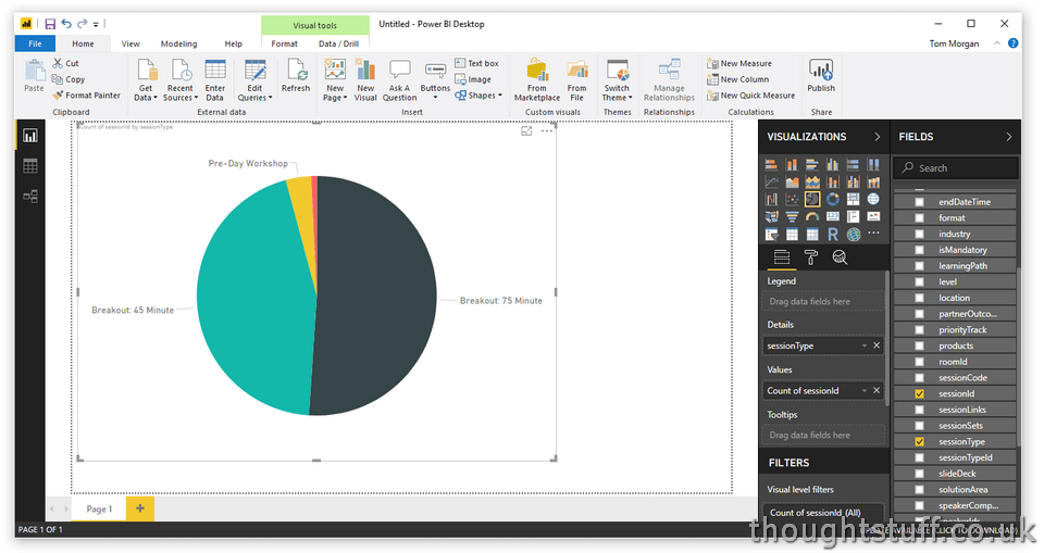
Once you’ve made it this far, you can start to have some fun. Click a visulization from the picker on the right, then drag columns from the Fields section into the hot-spot fields underneath it. For instance, I clicked on the pie-chart icon, then dragged SessionType into the Details hotspot, and sessionId into the Values hotspot. PowerBI is clever enough to guess that what I really want to do it Count the number of sessionIds for each SessionType, giving me this pie-chart:
There’s so much you can do with PowerBI and this blog post can’t possibly cover it all, but there’s also plenty of great resources out there including Documentation, Support and a super-active, friendly Community, so you’re in good hands. You also can’t really do any damage with PowerBI so play around with the data, try things out, see what visualisations you can come up with, even if don’t make any sense! Hopefully it’ll help you find just the right Ignite sessions to attend, or provide some interesting insights into the Session Catalog data.
Written by Tom Morgan
 Tom is a Microsoft Teams Platform developer and Microsoft MVP who has been blogging for over a decade. Find out more.
Related posts:
 Microsoft Ignite 2016 Session Catalog is now Live!
 Microsoft Ignite 2018 – Skype & Teams Developer Picks
Reading the runes – what does the Ignite 2018 Session Catalog tell us about Skype for Business & Microsoft Teams
Microsoft Ignite 2018 – Skype & Teams Developer Picks
Reading the runes – what does the Ignite 2018 Session Catalog tell us about Skype for Business & Microsoft Teams
 Weekly Update 18 August 2018: The one about Microsoft Ignite Sessions!
 How to: Use Microsoft Flow, Azure and PowerBI to capture and display Tweet sentiment analysis & key phrases