Build Microsoft Teams apps that look like they belong with the Teams UI Kit
The Microsoft Teams UI Kit is a relatively new resource, aimed at providing guidance and best practice to anyone building apps for Microsoft Teams. It’s mentioned in passing in the Microsoft Docs page:Â Design your app – Understanding the fundamentals – Teams | Microsoft Docs
It contains:
- fundamental design concepts
- Iconography
- Colours
- Typography
- Brand expression
- Basic UI components
- Templates and Best Practice
It’s hosted on Figma, which I was previously not aware of, but seems to be a collaborative design tool for graphics. You will need to register with a Figma account (which is free) in order to see the content.
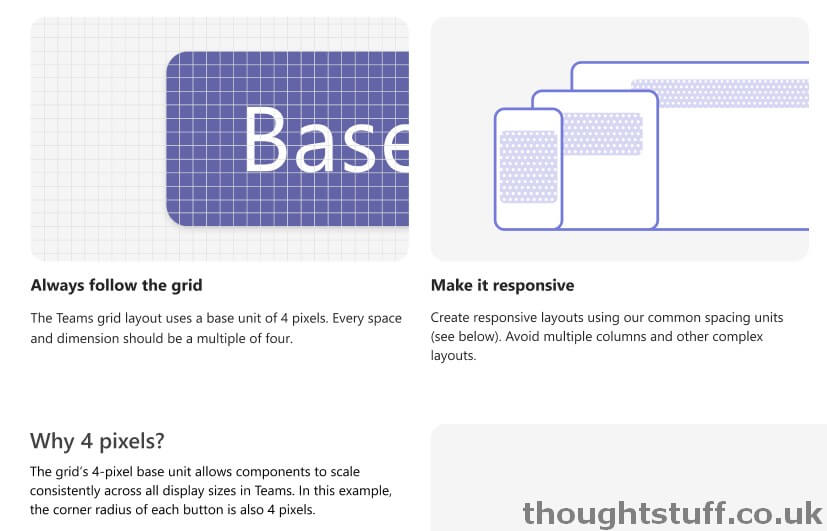
There is a great level of detail here for app developers and designers. For instance, did you know that the Teams grid layout uses a base unit of 4 pixels? A great pub-quiz tie-break question (maybe):

There’s also guidance for building bots, including on conversation style and best practice for content.


